Recipe Book: Page One
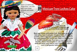
For this assignment, I had to make two recipe pages for our class recipe book. The theme was food from different countries around the world. The country I was assignment to was Mexico. So, I researched Mexican recipes before starting this project. This assignment was done in Publisher. The first thing I did was set up the page so that its dimensions were 8.5 X 5.5 inches. I then used Photoshop to edit pictures that related to my recipes. I then put all my different pictures together to form the background of the recipe page. I then typed the recipe into a text box and positioned it on the page. After that was completed, I saved my work. This same process was used for the second page of the recipe book. Once both were done, I saved my work and used duplex printing so that my final work was on one page. The first recipe I created a page for was for Mexican Tres Leches Cake. I first edited a red background to make it appear very textured, like mosaic tiles. I then edited a milk carton, in which my title would be coming out of. On the milk carton is an interesting fact about Mexico. In front of the milk carton is a picture of a Mexican doll. She is holding a maraca, which I used the clone stamp tool to add to the picture. On the side of the doll is a picture of a plate and fork with tres leches cake on it. The directions for this recipe are written over this picture.
Recipe Book: Page Two
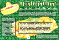
The second recipe I created a page for was for Sour Cream Chicken Enchiladas. The background for this page is similar to the one for the previous page. The background once again looks like mosaic tiles, but is the color green. At the top corner of the page is a picture of a Mexican sombrero. Next to that is a string of lights in the shape of chili peppers that were made to appear very bright. In the center of the page is a large picture of a sour cream chicken enchilada. I used the render tool to make sure that this picture was the focus of the page. I also used many other tools to alter it. Text boxes are used on the page for the directions to appear. The directions are also placed over the main picture of the enchilada. During this assignment, I received some feedback from my peers. My friends gave opinions and suggestions on how I should set up my page and gave ideas on what pictures I should use to portray my food recipe. I used their opinions and criticisms to make my piece even better. Throughout this assignment I further learned how to make words and pictures blend together in an eye-pleasing, but readable way. I used the elements and principles of design to make my page very clear and navigation friendly. These things can help me in everyday life, especially in the future when I have a career. If I were to do this project again, I would probably add more Mexican objects to my second page. This is because I think there aren’t enough images on it.
Can Label
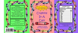
For this assignment, I had to create a can label. I chose to create a can label for crayons. To do this I had to first research what components were included in a can label. I found out that cans needed elements such as a nutrition label, a barcode, contact information, and other symbols. This project was done in Publisher. In order to find the needed dimensions for my page size, I had to calculate the diameter and circumference of the can using a ruler. I found out that my dimensions needed to be 9.7 X 4.125 inches. After setting up the page, I used the internet to find images of some of the elements needed on a can. I also used Publisher to create my own nutrition label. I used text boxes to write important information about crayons, and Publisher to edit images. My can label is separated into three sections: a green, a pink, and a purple. Each has a crayon border around it that was edited using Photoshop. The green section has the directions, the warnings, company name, the manufacturing location, and the barcode. The pink section is the main portion. It states the name of the product and what is contained in the can. The purple section shows the nutrition facts, as well as contact information, and shows that the can is recyclable. I didn’t receive any feedback from my peers during this assignment. This is because I completely the entire thing at my house, and therefore wasn’t able to ask the opinions of my friends. During this assignment I learned how to set up and proportion objects. Since a can is round, everything can not be seen at the same time. That is why I separated my work into three pieces. I also played around with sizes. I had to make sure that the nutrition label was easily visible, but not too big or small. I also had to make sure the barcode and the recycling symbol were the right size. Overall, I had to make sure all of the components of the can label blended together. This can be used in any of the projects I am assignment in school. Presentation is always important. If I were to do this project again, I would probably add more graphics and elements to my can. I might even change my entire theme and not choose crayons, but something harder that would involve more elements. This is because I feel as if my can label design is too simple.
Tie-Dye Shirts
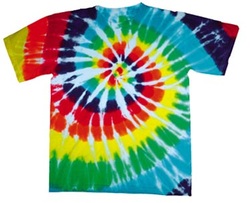
For this assignment, I had to make a tie-dye shirt. Before starting this assignment, I had to watch a video in class on the precautions and procedures involved in creating a tie-dye shirt. Also before starting this assignment, I had to decide which pattern I wanted to dye my shirt and actually bring in a shirt to school. Once this completed I was able to start the process. First, I put on gloves and an apron to protect myself from the dye and the water soda ash solution. I then took my shirt and soaked it in the soda ash until it was completely immersed. I then rang out the shirt. After this, I put the shirt inside out and laid it flat on the table. It was time to set up my shirt so that it would be a spiral pattern. I first started the spiral in the center of the shirt and then kept twisting and turning the shirt so that the whole thing became a circle. I then placed elastics on the shirt to hold it into place. Next, I used the bottles of colored dye in order to color my shirt. I used orange, blue, green, yellow, and pink. After this was completed, I put the shirt in a bag and left it for 24 hours. Following this step, I took the shirt out of the bag, rinsed it out, and left it to dry. During this assignment I learned how to make a tie-dye shirt using a spiral pattern. I did not know how to do that before. I could use this outside of school when I tie-dye for fun. I received some feedback during this. My friend gave me advice on which colors I should use. If I were to do this assignment again I would be more careful when tie-dying my shirt so that the colors won’t run. Overall, my shirt came out really cool.
Animations
For this assignment, I had to create five different animations using Paint and Photoshop. Before starting, I had to come up with a few simple ideas that I would be able to create an animation for. I was also instructed by the teacher on how to actually create the animations. For the animations using Paint, I first drew a simple picture. That picture was then saved as a GIF. I then slightly changed the picture in subtle ways, saving the picture as a new GIF after each of the changes. Once this was completed I then used the GIF animator to make my different images appear as if they were moving. Each picture was inserted into a frame. I then could control how fast each frame moved. This all depended on what my images were. Creating animations in Photoshop was a little different. The GIF animator wasn’t used because Photoshop has its own animation tool. Once the first frame was created, it was duplicated to create the second frame. In this duplicate frame, you are able to move some component of the original frame slightly. The link tool was then used to link the two frames together. You can set how fast the frames go and also choose how many frames you want in between the original and second frame. The computer creates frames itself to present gradual movement. This process was then continued until the animation was complete.
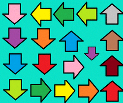
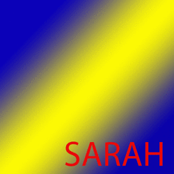
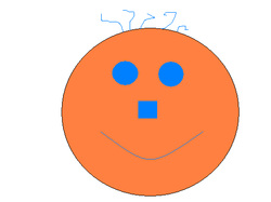
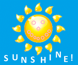
The first four animations that I created were made in Paint. The first consisted of two frames. It was a smiley face. In the first frame the face was smiling and in the second it was frowning. The second animation I did was a swirl of arrows. As the frames went on more arrows appeared on the screen. The arrows went around the border and then into the middle. The third animation was a sun. During the animation, eyes, a nose, and a smile were added to the sun. Then, the word sunshine was displayed on the screen one letter at a time. The fourth animation was a firework. In the first frames the firework was travelling up in the sky. In the next frames, the firework exploded. My last animation was my name bouncing across the screen. This was the animation done in Photoshop. In this the background was blue and yellow and my name was red.
During this assignment, I learned how to make animations using different programs, such as Paint and Photoshop. Before this, I had never made an animation before. I could use this in future projects and assignments. I received feedback from my peers while creating the animations. They gave me ideas on what I should make move and advice on how to go about doing so. If I were to do this project again, I would probably try to create more complex animations. I feel as if some of mine didn’t have enough movement. So, if I were to do this, my project as a whole would improve.