Calendar: Sheet 6 Side 1
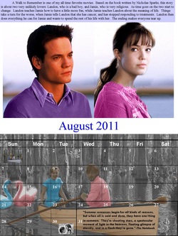
This graphics project was a continuation of the 2011 calendar. Sheet 6 continued to follow my theme of movie quotes. Before starting this, I had already assigned a quote and a movie to each month. Important dates were then found for each of the months on the sheet. I used a template for each month so that I would just have to copy it into the document, instead of making one myself. After this was completed, I was ready to officially begin working on this calendar sheet. This project was also done using Publisher. I first separated my page into two equal parts. The top half would be for the movie picture and the bottom half would be for the actual calendar, just like the previous page. The first month I started with was August. So, I inserted the August month template and re-sized it to fit the bottom half of the page. I then typed in the important dates that occur in that month. The template was set to be transparent so that I could put a picture in the background. However, the picture had to be brightened so that all text on the template was visible. For this project all pictures had to be edited in some way. To do this, I used Photoshop. The blank boxes in the calendar also needed to be filled, so that is where I put my favorite movie quote. In the other empty boxes I put a small image of the original pictures used in order to prove that I made them my own. On the top half of the page is where I had to write five sentences to summarize the events of the movie. The top of the page was for the month of June. This paragraph was placed on another edited picture relating to the movie. This is all that was put on the top half of the picture. This same process was used to design the back side of the sixth page. The only difference, however, is that the top half of the page was for the month of September, and the bottom half was for May. After this was completed, all work was saved, and the page was printed duplex style. The movie for the month of June was “A Walk to Remember.” At the top of my page is an edited picture of Landon in Jamie in front of clear, colorful sky. To edit this picture, I took one of Jamie in front of a telescope and changed the background to math the picture of Landon using the clone stamp tool. This made it seem as if the two pictures were one. Also, I changed the colors of their clothing using the color replacement tool. I changed it so that the colors of the clothing were similar to the colors within the background. At the top of the picture was my paragraph describing the movie. At the bottom of this side of the page is the actual calendar for the month of August. The movie for this month was “The Notebook.” For this picture of the famous boat scene, I decided to change the whole background to a gray color. This would take away from all of the textures and colors that seemed unimportant so that viewers could pay more attention to the template. I then decided to put two swans in the water using the clone stamp tool. Then, using the color replacement tool I made significant parts of the picture stand out, such as Noah and Allie, the swans, and the boat. I chose colors that would stand out against the gray, which ended up being mostly pink and blue. I then put the quote from the movie at the bottom, making it look as if the quote was on the boat.
Calendar: Sheet 6 Side 2
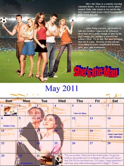
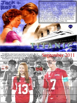
The month of September is on the first half of the second side of the sheet. For this month I chose the movie “She’s the Man.” The main picture I used was the movie poster. I cropped it so that only the main characters were left. I then found a picture of a soccer stadium. Considering that is one of the main topics of the movie, I decided to use it. So, I used the picture of the soccer stadium and put it behind the characters. I then centered them towards the left of the page. On the right side was my brief synopsis of the movie, and at the bottom I put the movie’s name. The bottom of this page was for the month of May. For May, I chose the movie “Titanic.” For this, I took a picture of the titanic staircase and edited it using a filter to appear very light, sort of like a photo copy. I then found another picture of Jack and Rose, changed their clothing a little bit, and used the clone stamp to add them to the stairwell picture. The picture was then lightened and put behind the transparent template. At the bottom spaces of the calendar was the movie quote, which occurred when Rose was going to jump of the back of the ship. For this assignment I received a lot of feedback from my peers. This is because I was told how to go about changing my background. It was during this assignment that I learned to use the clone stamp tool to create my backgrounds. This was taught to me because of the feedback from my peers. They also helped me decide which movie pictures were best to use, and most of the time I followed the advice given. During this assignment, I learned how to use many new tools in Publisher, such as clone stamp tool. I also strengthened my new skills using the color replacement tool. This really helped me to change the original pictures in order to make the color schemes I wanted. These tools can be used outside of school. Sometimes it could be fun to edit pictures of you and your friends and put yourself behind different backgrounds. If I were to do this project again, I would change some of the little things, including blending the different pictures together more. This is because a line appeared after printing. I would also change my choice of using word art. This didn’t make my work look as professional as it could have been.
Calendar: Sheet 5 Side 1
Sheet 5 was the next sheet assigned for my 2011 calendar project. This sheet once again followed my theme of movie quotes. Each month on this sheet was previously assigned with a specific movie and quote. Important dates were found for each of the months, and a template was found and used to make things simpler. All of these things needed to be completed before actually starting the assignment. Like the other sheets, this project was done using Publisher. The first thing I did was separate the page into two equal parts, so that the top half could be used for the movie picture and the bottom half could be for the actual calendar. September was the first month I started with. The template for this month was inserted and re-sized to fit the bottom half of the page. In this template, I added in the important dates I had previously found for that specific month. In order to be able to place a picture behind the template, I made it transparent. The pictures used had to be altered in some way using Photoshop. Then, it could be placed on the calendar and fixed to fit the circumstances, such as changing brightness. I then filled the empty boxes of the template with original versions of the pictures edited to show proof of editing. The quote was also placed on the bottom half of the sheet. On the top half of the page is where I had to write five sentences to summarize the events of the movie. The top of the page was for the month of May. This paragraph was placed on another edited picture relating to the movie. This same process was used to design the back side of the sixth page. The only difference, however, is that the top half of the page was for the month of October, and the bottom half was for April. After this was completed, all work was saved, and the page was printed duplex style. "Titanic” was the movie assigned for the month of May. For editing this picture I used a lot of the color replacement tool. I changed the water so that it appeared a darker blue and the color of the boat so it would appear duller. I changed the color of the letters in the title. I changed the color of Rose’s dress and the atmosphere behind the couple. In the corner, using the paint brush tool, I wrote the name’s Jack and Rose. I thought this would add a nice touch to the mood of the picture. Also, using the clone stamp tool, I added in a picture of the heart of the ocean, because it is a significant item throughout the movie. In the top right hand corner is my paragraph summary, which was given a border.“She’s the Man” was the movie for the month of September. The picture is one from the end of the movie in which the team is on the soccer field. I used the color replacement tool in order to make everyone and everything besides the two main characters to appear black and white. This would give emphasis to the main characters. In this movie, the girl main character dresses up as a guy to be on a soccer team. So, using the clone stamp tool, I put her “guy” face into as many of the background players as I could. This added a little humor to the picture. The quote is located at the top of the bottom half of the page right next to where the month is given.
Calendar: Sheet 5 Side 2
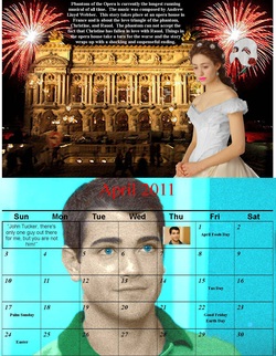
For the month of October I chose “The Phantom of the Opera.” For this picture, I decided to use one of the opera house. I then used the clone stamp tool to put in pictures of fireworks. This was then put through a picture to look a little sharp and blurry. I then found a picture of Christine and put her in front of the opera house. I used the color replacement tool to make her dress and hair pieces gray and her lips bright pink. I then added a picture of the phantom mask and a rose using the clone stamp tool once again. At the top of this is my paragraph summarizing the movie. For the month of April I chose the movie “John Tucker Must Die.” For this, I used a picture of the main person/idea of the whole movie: John Tucker. I used the color replacement tool to make the background and his eyes blue, and his shirt green. I then used a filter to make the picture appear grainy. The quote was then placed in the empty spaces of the template. For this assignment, I received little feedback from my peers. Only occasionally did I ask if something blended well or if the picture looked good. At all times, I took their comments into consideration and changed some things based on their opinions. During this assignment, I further learned to use the clone stamp tool. I am now able to use it for the more intricate details of pictures. I also learned to use the filter options to my advantage to change my pictures up a little bit. These things could be used outside of class because I now know how to add people into pictures. If I were to do this project again I would only change some of the quality of the pictures. This is so that they won’t be as many pixels. I would also make sure my wording didn’t have hyphens in order to give my work a more professional look.
Dodgeball Ticket

All level one students were assigned to make a t-shirt and ticket design for my school’s annual dodge ball tournament. Before we could start designing in Publisher, we had to know some things. We were given some specific details of the tournament, such as date, time, place, and price per ticket. This is the information we needed to know in order to design a ticket and t-shirt. The first piece I did was the ticket. I created it using Publisher and set up the ticket size so that eight would print per sheet. Then using the tools of Publisher, such as word art and shapes, I created the ticket. All around it is a border of dodge balls that were filled in red. The dodge balls on the shorter sides of the ticket had a letter in each of the balls, spelling out admit one in white lettering. This gave the ticket an official look. At the top in word art is the title that states the 7th annual dodge ball tournament in blue and red lettering. Under this are the more specific details in blue, such as the date, time, and place. On the sides of this in large blue lettering is the price of five dollars. My design is very simple, yet includes all needed information.
Dodgeball T-Shirt
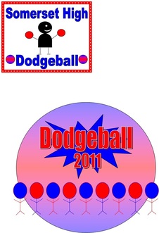
The next piece I did was the t-shirt design. This came in two parts: the front pocket and the back. I designed this using one paper: the top half for the front pocket and the bottom for the back side. My designs consisted of a lot of shapes and word art. I created stick figures to represent the dodge ball players and played around with fill affects. The front pocket of my t-shirt is a basic outline of a red square. Inside this, is word art stating my school’s name and the tournament. There is also a picture I created of a person holding two dodge balls. The back of my t-shirt is basically a huge dodge ball, filled with both red and blue coloring. These colors were used throughout my t-shirt and ticket. Inside that dodge ball is a banner stating dodge ball and the year 2011. At the bottom of the large dodge ball are many stick figures. Each of the heads of the stick figures has a color, representing the different teams in the game. For this assignment, I received no feedback from my peers or teachers. This is due to the fact that this whole assignment was done by myself at home. So, nobody saw my work until it had already been completed, and I wasn’t able to fix anything. Also during this assignment, I didn’t learn much. We were only able to use the simple tools of Publisher to create our designs. That is why I didn’t really learn anything new. However, I realized that sometimes when it comes to designing, simpler is better. This is because in things like tickets, the information needs to be clear, not busy. This can be used outside of school because sometimes it is not helpful to go above and beyond, but to stick to the given requirements. If I could go back and change anything, I would change the front pocket of my t-shirt. This is because looking back, it doesn’t exactly fit with my back design. I should have used the same colors and the same people.
Calendar: Sheet 4 Side 1
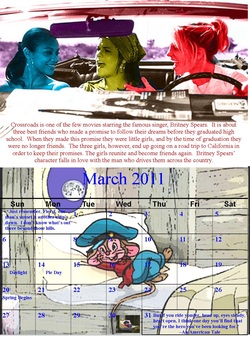
For this assignment, I had to complete sheet 4 for my movie quote themed calendar project. Like all of the previous sheets, before starting I had to choose a movie, movie quote, find pictures, and research important events. Once again, this project was done in Publisher. After setting up the sheet and inserting the templates, I edited my pictures using the tools of Photoshop. The new pictures, that I made my own were then inserted into the calendar. Important dates were written in along with a summary for each movie. The first month I did was for the month of November. The movie for this month is “Crossroads” and it was located at the top half of the sheet. The picture I edited was when the three girls were driving during the road trip. I used the color replacement tool to make each girl appear a different color. I also used this tool to re-color the car and background. At the bottom of the car is the paragraph of my summary. The bottom half of the sheet is for the month of March. The movie for this month is “An American Tale”. For this picture I edited the scene when Fievel is singing “Somewhere Out There.” I used the clone stamp tool to put a picture of the moon in the window. I then used the brush tool to re-color the entire mouse to make his coloring appear brighter. Using the burn tool, I then made him look darker in order to stand out. Everything around the mouse was altered using the dodge tool. The movie quote was added to the empty calendar spaces.
Calendar: Sheet 4 Side 2
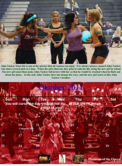
. For the backside of the sheet, the month on the top half is for April. This movie was “John Tucker Must Die.” The picture I chose was when all four girls are playing dodge ball. To alter this picture, I used the dodge tool in order to lighten the background. I used the burn tool to make the girls darker, and the color replacement tool to create unity. Each girl had the same color on some part of her in order to tie them all together. The summary was then placed at the bottom of the picture. The bottom half of the sheet was for the month of October. The movie for this month was “The Phantom of the Opera.” I used a picture of the masquerade scene and used the color replacement tool to make the entire picture red. I also put the picture through a filter to make it appear like a poster cut out. I placed the quote in the empty spaces of the calendar template. For this assignment, I received some feedback from my peers. I asked if something looked good and fit together; I asked opinions on how I should alter a picture. I then took their opinions and ideas and used them to complete this assignment. During this assignment, I further experimented with the dodge tool. I am learning how to draw focus to certain things in my pictures. This could be used outside of class because I now know how to focus attention of the simple things. It is easy to draw the eye to something important. If I were to do this project again I would only change some of the editing I did to my pictures. I would have tried to do something more creative with the one from “The Phantom of the Opera” instead of just making it red and putting it through a filter. I would have also done more to my picture for the month of April. This would have made my work a little more creative and pleasing to the eye.
Calendar: Sheet 3 Side 1
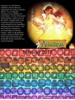
For this assignment, I had to complete sheet 3 of my calendar, which is based on the theme of movie quotes. Before starting this sheet, I once again had to choose a movie, a quote, a picture, and important events that would occur in that month. This project was done in Publisher and used the tools of Publisher to re-create the pictures I used. I then inserted my new pictures, along with the month templates, into my calendar. I also included important dates and a summary of each movie. The first month I did was December, for the movie “Anastasia.” On this first half of side one I put a picture of Anastasia in her ball attire. I edited so that the picture looked as if it was weaved on a blanket, and made the background dark and the girl stand out. To do this I used a filter, lighting effects, and the burn tool. I also used the clone stamp to make the title of the movie appear at the bottom. The summary was placed on the side. The bottom half of the sheet was for the month of February, which was for the movie “Forrest Gump.” I used the color replacement tool to make the picture of the candy box all different colors of the rainbow. I also put it through a filter to make the outlines of the candies more pronounced. The movie quote was then put in the empty boxes of the month template.
Calendar: Sheet 3 Side 2
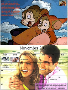
March was the month on the top of the second side of the sheet. This was for the movie “An American Tale.” The picture I chose was when Fievel and his girlfriend were flying. To edit this picture I used the clone stamp to add in the picture of a sky and the color replacement tool to change the color of their outfits. I then put the picture through a filter to make it appear more like a poster board cutout. The bottom half of the sheet was for the month of November and the movie “Crossroads.” I chose a picture of the main character and her boyfriend. I used the color replacement tool to change their outfits, and the clone stamp tool to add in the scenery of a beach. I then used the dodge tool to lighten the background and the burn tool to make the characters appear darker. During this assignment, I didn’t receive much feedback from my peers. Once in a while I asked them if it looked okay, but other than that I didn’t receive much advice or opinions. Also during this assignment, I didn’t learn that much. I only further strengthened my knowledge of the tools I already knew how to use. However, my eye for design has gotten increasingly better due to all of the practice. If I were to do this project again, I wouldn’t change much. I like the way my images came out and the tools I used. I would, however, fix some parts of the images that appeared blurry or had visible pixels.
Calendar: Sheet 2 Side 1
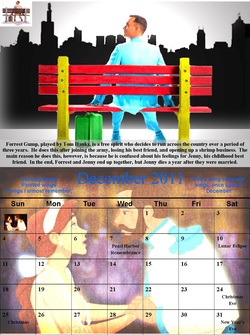
For this next assignment, I had to complete sheet 2 of my movie quote themed calendar. I chose the movie, a quote, a picture, and important month events before starting this assignment. I used both Publisher and Photoshop to complete this sheet. I used a month template, and altered all of my pictures to make them my own. The pictures, templates, summaries, and important dates were inserted into my calendar. “Forrest Gump” was the first movie I did on this sheet, for the month of February. I used the well known movie poster of Forrest sitting on a bus bench. I used the color replacement tool to change everything in order to make the picture bright and colorful. I then added a black and white city skyline to the picture to add another dimension. Light effects were then used to make Forrest the most important item in the picture. The summary was placed at the bottom. The month on the bottom of the page was December, for the movie “Anastasia.” To alter this picture I used the color replacement tool, and a filter to make the picture appear very smooth and delicate looking. I then used the burn tool around the edges and the dodge tool to lighten the middle of the image.
Calendar: Sheet 2 Side 1
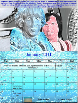
“Blades of Glory” was the movie used for the month of January. To edit this image I used many layers. The first was of ice, the second ice skates, and the third was the main characters. I edited the ice, the skates to make the lines defined, and the neon glow and a filter to make the edges sharp to the boys. I layered them to give the picture a more dimensional look. The summary is written at the top. The bottom half of the sheet is for the movie “Gone Fishin’” and the month of January. The picture I used was of water. I used the color replacement tool to make it a bright blue and a filter to make the water bubbly. I then put the quote in the empty spaces of the template. During this project, I received feedback from my teacher. He gave me advice on how to make my picture for “Blades of Glory” better. He gave me input on how to layer my different pictures. I also learned how to layer pictures during this sheet. I learned to use tools like the quick selection tool. It is an easier way to combine images than using the clone stamp tool; sizing of the image is no longer an issue. I can use this outside of class in other school projects or designs. If I did this sheet all over again, I think I would redo the picture from “Forrest Gump.” This is because out of all the pictures on my sheet, it is the plainest; so I could do more to make it interesting
Calendar: Sheet 1 Side 1
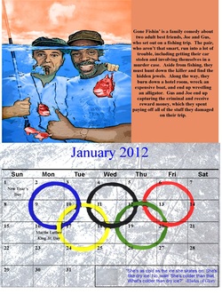
For this last assignment of the movie themed calendar project, I had to complete sheet 1. Before starting, I chose the last movies, quotes, pictures, and important dates. Using Publisher and Photoshop I was able to complete my sheet. I altered all of my pictures and used month templates. I inserted pictures, templates, summaries, and important dates into my calendar. “Gone Fishin’” was the first movie I did on this sheet, for the month of January. I used the picture on the movie cover and used the color replacement tool to change the water, fish, and sky. I also put the picture through a filter in order to give it a poster look, with a lot of defined lines. A text box filled with the same color as the sky held my movie summary, which was located on the side of the edited picture. On the bottom half of that sheet was the template for January 2012. This was for the movie “Blades of Glory.” I first edited a picture of ice. I colored some spots to make it a grey and white picture and then put it through a filter to make the scratches clearly visible. I then used the dodge tool to lighten this image. Using the clone stamp tool I then inserted a picture of the Olympic Games symbol. I burned the symbol to make it appear dark against the light ice. I also put the symbol through a filter to make the circular shapes very prominent. I then put the movie quote into the empty spaces of the template.
Calendar: Sheet 1 Side 2
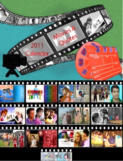
On the opposite side of the paper are both my cover and the back of the calendar. On the cover I used a roll of movie film as my main designed. The movie film was filtered so that it looked like plastic. I also used another filter to make the film looked smudged with bold lines. In each of the frames, I used the clone stamp tool to insert some pictures of my favorite characters. I then used the color replacement to make the inserted pictures black and white to match the film. In the corner is an edited picture of a movie marker. The neon glow filter was able to make the marker appear orange and another filter allowed it to seem like a cutout. In the other corner is a picture of a camera. The back page of my calendar is where I put all of the thumbnails of all the pictures I used for each month. Using the theme of my front cover, I also put all of these thumbnails into a roll of movie film. Each different slide had pictures for a certain month. This was meant to give a preview of what the inside of my calendar would be like. During this assignment, I received feedback from my peers. They were the ones who gave me the idea to put the movie pictures in the frames of a roll of film. I took there advice and it ended up tying the whole theme of my project together. Also in this project, I further strengthened my skills at using the quick selection tools instead of the clone stamp tool. My front cover consisted of many layers because of this, and I was able to do special affects on different items in the same picture. This can be helpful in other school projects. I am not able to mix many different pictures and designs into one. If I were to do this assignment again, I probably would have fixed my back cover. I would have tried to make the rows of film even so that two pictures weren’t lonely on the bottom. This would have made the image more balanced. I also would change the picture for the movie “Gone Fishin’” because I feel that it looked too much like the original. I would be more creative with that picture if I were to do this again and make it look different.
