Magazine Ad!
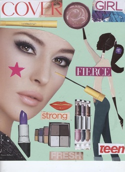
I did my magazine ad on Cover Girl make-up products.
To create this ad I cut out clips from other magazines that
described what the product was all about.
I then used those clippings to create an ad using the elements
and principals of design that we learned about in class.
My piece uses emphasis, color, line, texture, and many other
elements and principals of design.
Hope you like it!
Windsheild Flyer!
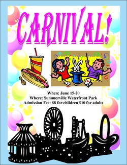
In class we talked about how windshield flyers help to promote services, and advertise events. These flyers can sometimes be found on the windshield of a car after concerts, fairs, and other popular public events. In this assignment we were able to advertise anything that we would like. I chose to promote a carnival because I thought it would be a fun idea and I was able to use lots of colors. When creating this flyer, we had to keep in mind the elements and principals of design from the previous activity.
Tri-Fold Brochure Side One!
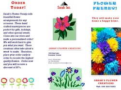
This is the front side of my practice tri-fold brochure. For this assignment, we used one of the templates for tri-fold brochures in Publisher. We were then able to choose any service that we wanted to make this piece. I chose to pick a flower shop as my service. This shop would make and deliver flower arrangements for any occasion. This side of my brochure gives very general information. The name of the shop, where it is located, contact details, and a brief description of the service is given.
Tri-Fold Brochure Side Two!
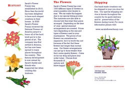
This is the back side of my practice tri-fold brochure. This is the side that goes more into detail about the flower shop. The history of the shop, a description of the flowers and arrangements, and information about shipping are stated here.
Self Portrait!
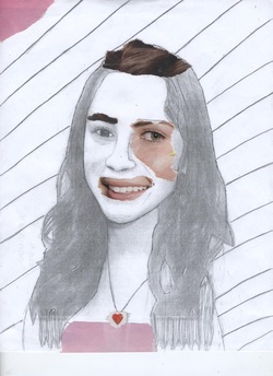
For this assignment, we had to alter a picture to make it look like a drawing and then cover it with clippings from magazine. To do this, we first had to take a picture and scan it into the computer. Then using Photoshop we were able to make the drawing look more like a sketch. After printing it out, we then outlied the major lines of the picture using a pencil. This paper was then copied so that the lines looked even lighter. At this point, the picture looked like a hand made drawing. The next step was to cover the face with magazine pictures in order to distort the facial features, as well as other features in the picture. Now, this picture looks a lot different from the original.
Thayer Street Brocure Side One!
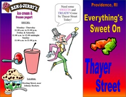
In this assignment, the class had to make a tri-fold brochure about Thayer Street in Providence, RI. Using creativity, the information I collected, and the elements and principals of design, I was able to complete this assignment. Before we could begin creating our brochure, we had to learn about the different shops that were located on Thayer Street. To do this, the class went on a fieldtrip. Each person was given a specific topic to create their brochure on. I was given the category of “Sweets and Treats”. So, while walking up and down the streets, I had to learn information about the different stores that fit my topic. Also before making the brochure, the class had to understand and know how to use the elements and principals of design.
All of my research was done while I was at Thayer Street. The shops that I found that fit under my specific category of “Sweets and Treats” were Starbucks, Brown Book Store, Tealuxe, J&J’s Candy Shop, Ben and Jerry’s, and Meeting Street Café. All of these places had some sort of delicious pastry, dessert, or drink that I think would be special place for someone to go. Upon arriving at these stores, I found out the names of the shops, why someone would go there, what they sell, hours in which they were open to customers, where they were located, and any other bits of information that I thought would become useful. This would then be the facts that I would put into my brochure. Once the class returned to the school, our job was to take what we learned and produce the actual brochure using Publisher. The first step was to divide the paper into three equal sections. These sections would then become the panels of the brochure. To do this I used the ruler on both the side and top of the page and the line tool. Once this was completed, I was able to fill each of the three panels with information regarding Thayer Street. I used many fun colors that represented the sweets and treats, word art, text boxes, clip art, and even Photoshop to alter some of the pictures I had found online. I also used many other tools that were available on Publisher. Before I knew it, all sides of the brochure had been designed. I then checked over my work to make sure that all of the words were spelled correctly, the information was correct, and nothing would be cut off during printing. After this I saved my work and printed my brochure out using duplex printing so that my work appeared on both sides of the paper.
All of my research was done while I was at Thayer Street. The shops that I found that fit under my specific category of “Sweets and Treats” were Starbucks, Brown Book Store, Tealuxe, J&J’s Candy Shop, Ben and Jerry’s, and Meeting Street Café. All of these places had some sort of delicious pastry, dessert, or drink that I think would be special place for someone to go. Upon arriving at these stores, I found out the names of the shops, why someone would go there, what they sell, hours in which they were open to customers, where they were located, and any other bits of information that I thought would become useful. This would then be the facts that I would put into my brochure. Once the class returned to the school, our job was to take what we learned and produce the actual brochure using Publisher. The first step was to divide the paper into three equal sections. These sections would then become the panels of the brochure. To do this I used the ruler on both the side and top of the page and the line tool. Once this was completed, I was able to fill each of the three panels with information regarding Thayer Street. I used many fun colors that represented the sweets and treats, word art, text boxes, clip art, and even Photoshop to alter some of the pictures I had found online. I also used many other tools that were available on Publisher. Before I knew it, all sides of the brochure had been designed. I then checked over my work to make sure that all of the words were spelled correctly, the information was correct, and nothing would be cut off during printing. After this I saved my work and printed my brochure out using duplex printing so that my work appeared on both sides of the paper.
Thayer Street Brocure Side Two!
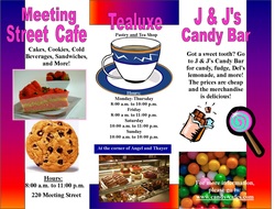
Overall, I liked my final output. The cover of my Thayer Street brochure has a colorful, rainbow background and a catchy title that states “Everything’s Sweet on Thayer Street”. When you first open the brochure there is one panel to advertise Ben and Jerry’s ice-cream and frozen yogurt and another panel to promote the Meeting Street Café. If you open up the brochure even further you will find one panel marketing Tealuxe and another on J&J’s Candy Shop. In all of these panels there is some stripe of rainbow color that is seen on the front cover in order to create a theme throughout the brochure. Also, in each of these sections was some sort of description of the business. I included what was sold there, the working hours, sometimes where is was located, and in some cases where to go for further information. On the back of my brochure is a picture of Willy Wonka. I thought that this was a creative idea that would symbolize the sweets and treats. Throughout this process, I relied on the opinions of my peers to help me to create my brochure. At some points I would ask how they liked an arrangement of pictures, or the colors I used. At other times I would ask them for creative ideas to portray something or ask them how to use a certain tool to make something look better. This feedback helped me to improve the quality of my brochure, and become more confident with my work. During this assignment, I learned how to use different aspects of Publisher and Photoshop. Prior to this, I had never used Photoshop before. So, during this time I learned how to change images to make them look different using the filter tools. I also learned how to change some of the colors in a picture. I also learned some new things in Publisher such as how to take the hyphens out of words, and how to use different fill affects in text. These things can be helpful in other situations. It is always important to know how to change text, alter pictures, and take hyphens out of words. These things will make something more fun or business looking. I could use what I have learned in other assignments such as collages, posters, or business cards. If I needed to apply these things I would know how to do it using Publisher and Photoshop. If I were to do this project again I would only do a few things differently. First off, I think that I would write more information about each business. Looking back, I feel that I was too general when I only listed what was sold and the business hours. I don’t think that I really advertised the business in an effective way.
