19 Grand Flyer
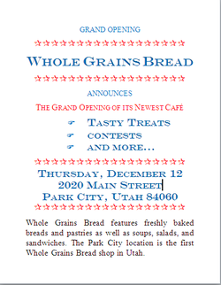
For this assignment, I had to create a flyer for the grand opening of a new cafe using Microsoft Word. To complete this assignment, I had to insert several Wingding fonted symbols into the flyer. I also had to be able to change font size, font color, font style, as well as be able to change the spacing between paragraphs and phrases. It was also necessary to set up a tab and to justify or center certain texts. Other effects included shadowing and engraving of the text. During this assignment, I learned and accomplished how to format different aspects of a flyer. It was difficult to line up both the symbols and the text in the correct way. It was also difficult to space certain parts of the text. This is because the directions never stated how many spaces should be in between each line. So, I had to guess how many spaces to put so that it looked like the example in the directions.
Some of the skills that I think I did well on were the font size, font styles, font color, and justifying or centering texts. These are the parts of the assignment that came easy to me. It was also easy to manipulate the text to make it appear in small caps, all caps, or make it look engraved and shadowed. To improve my work in this assignment, I could have gone above and beyond the minimum requirements by inserting a picture for the background of the flyer. This would have made the flyer look more interesting and visually appealing.
Some of the skills that I think I did well on were the font size, font styles, font color, and justifying or centering texts. These are the parts of the assignment that came easy to me. It was also easy to manipulate the text to make it appear in small caps, all caps, or make it look engraved and shadowed. To improve my work in this assignment, I could have gone above and beyond the minimum requirements by inserting a picture for the background of the flyer. This would have made the flyer look more interesting and visually appealing.
31 Web
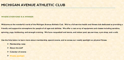
The assignment, 31 Web, required me to make a single file web page for the the Michigan Avenue Athletic Club using Microsoft Word. In order to complete this assignment, I had to do several tasks including applying the Solstic theme to the document, adding Parchment texture to the background, inserting a Wingding symbol, and linking a piece of the text to a website. During this assigment, I learned and accomplished how to both add texture to the document as well as link a website to a document. Before this assignment, I had only just learned how to link certain texts to pieces within a document. This was the first time that I actually had to link it to a website. Adding texture was also new to me. I have never actually changed the background texture of a document before. The part of this assignment that I had the most trouble with was alligning all of the text with proper indentations, as well as using the heading tool to underline the title like in the picture shown above. This is because when using the tab to indent the wingding symbols and texts, both the symbol and the text were set at different tabs. I think I did well with mostly all of the skills needed to complete this assignment, except the areas I had trouble with that were mentioned above. I was easily able to apply a theme, change the background, and insert a hyperlink. If given the chance to do something differently, I would have changed the font theme to make the web page more eye-pleasing, or insert a picture.
32 Lapage
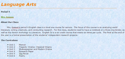
32 Lapage required me to make a single file web page for my English class using Microsoft Word. To complete this assignment, I had to write about my english class (teacher, period, overview, curriculum, required reading), choose a theme, change the background, insert a hyperlink, insert a Wingding symbol and format the text. This was the first assignment that I was able to be creative with my page design. I learned and accomplished how to make a page visually appealing. I had to choose and background and theme that complemented each other. I chose the blue tissue paper background and the Aspect theme. I thought that the blue background color made the orange title stand out, but did not make the other text hard to read. The part of this assignment that I think I did well with is the writing part, inserting a hyperlink, and formatting the page. It was easy to write about my English class because I was able to look at the syllabus to find information about the English curriculum and the required reading. Inserting the hyperlink and formatting the page also was easy for me because of all the practice I had using these skills prior to this assignment. To further improve my web page, I would have changed more text to the color orange in order to highlight the important information on the page, such as the headings. I also would have used different font styles to highlight the important information as well. This would have both made the page more visually appealing and helpful to readers.
