CD Cover 1 Side 1
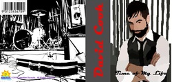
To start the second term off, the class was assigned to create two cd covers in Publisher; one where we were able to choose our own song and the other one where the song was given to us. Before starting this process, I had to know how to use the different tools of Publisher, Paint, and Photoshop. Also, before actually beginning the creation of the cds, I had to choose a song that was appropriate for school. I chose “Time of my Life” by David Cook. The song that I was assigned by my teacher was “Shelter from the Storm” by Bob Dylan. It was also probably a good idea to research the meaning of the song in order to convey the right message on the cd cover. Using Publisher, I had to format a new page so that when printed, the sheet could be folded to fit into a cd case. The dimensions of the page ended up being about 4.75 X 10. My next job was to read through the lyrics of the song. This would then help me to think of ideas to use for the images on the cover, inside, and back of the cover. For the first cd cover, the class was required to use and modify a picture of the artist. For the second cd cover, we weren’t allowed to use any pictures of them. To modify a picture of David Cook, paint was used. We used the color picker to go over the color pixels of the original image. This would then make the picture seem less lifelike. Once this modified picture was transferred on to the cover, I had to download a new font for the title, which consisted of the name of the artist and song. On the inside of the cover, we had to put the song lyrics. I then decided to find some image that relates to the song or artist to set as the background behind it. It was then my job to change the color and style of the font so that it could be easily read and tied in with the picture. On the back of the cover, we once again had to find another picture that tied in with the cd’s theme. For the pictures used, we had the option whether or not we wanted to alter them in paint. This meant that we could change the color scheme or make it appear different. Also on the back, we had to include a barcode, copyright, cd logo, and record label. The record label was the one thing we had to make, the other stuff we were able to get off of the internet. In order to make our record label we once again had to use paint. We were able to choose whichever name we would like and then create a graphic to somehow represent it. I chose to make my record label Sunshine Records. The label was a cloud with a sun with the name across it in blue. After this was all on the cover, it was then saved and printed out. The paper was then cut and folded in order for it to fit in the test cd case.
CD Cover 1 Side 2
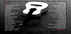
My first cd cover is for the song “Time of my Life” by David Cook. The theme that I used for my cover was grayscale. Almost all of the pictures and words I used throughout are black, white, or some form of gray. On the cover is my modified picture of the artist. This picture is centered towards the right of the cover. On the left is a grey background which contains the name of the artist in red. This made the name really stand out. The title of the song is written in black towards the bottom. On the inside is a grey and white picture of an acoustic guitar floating on water. This really represents my artist due to the fact that his main instrument is guitar. The lyrics are written in white to contrast the grey of the water. Certain key words such as lyrics are written in red to once again stand out. I then put a border around the lyrics to give the inside a little something extra. On the back of my cover is a black and white image of an empty stage full of band instruments. The barcode, record label, copyright, and cd logo is also included to make the cover seem more realistic.
CD Cover 2 Side 1
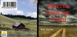
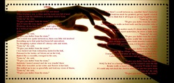
My second cd cover is for the song “Shelter from the Storm” by Bob Dylan. For this cover, I set the front, middle, and back up like a story. On the cover is a picture of a muddy trail in the middle of nowhere with large, dark clouds in the sky. This signifies that there is a storm, or a tough time yet to come. The title of the song is written in the dark clouds in red. The artist is written in white towards the bottom in the grass. For this image, I made the clouds darker. On the inside is a picture of two hands reaching towards each other. This shows that during tough times, there is always someone out there to help. Due to the size of this picture, I had to put a black background behind it. The lyrics to the song are in red so that they can be easily read. This color matches that of the front cover. I also put a border around the lyrics. This I feel, made the whole dynamic of the image pop. On the back is a picture of a house surrounded by beautiful scenery. The brightness of the colors in this picture was altered. The setting of this picture is closely related to the one on the front cover. This signifies how after the storm, everything gets better. Also on the back is the record label, copyright, barcode, and cd logo.
CD Cover 2 Side 2
During this project, I received feedback from my peers as well as the instructor. For both cd covers, I asked my friends whether or not all sides of the cover flowed together. I also relied on their opinions for my alterations of the pictures and the fonts used. Their comments helped me to make my project better. I used their advice and changed some of my pictures and font styles and colors to make my work more pleasing to the eye. My instructor told me that some of my images had to many pixels, which made them appear blurry. I used his feedback and decided to find a whole new set of pictures that would still relate to my theme. Also during this assignment, I learned how to modify pictures. Before this class, I had never done that before. Besides that, I learned how use Photoshop to alter pictures. In addition, I further explored how to incorporate the elements and principals of design into my pieces. I can apply what I have learned in other areas. For example, an English project of mine gives the option of creating a cd cover and songs to represent a book. I could also use what I learned to make people gifts. If I were to do this project again I probably would have spent more time modifying the picture of my artist. This is because I feel like I rushed through it and ended up making it look too unrealistic. There were not enough shades of color in his face. I probably also would have changed some pictures on my second cd cover. This is because looking back on it now, I feel as if all of the different sides don’t blend together. The middle section is too different from the other two sides. I would try to add in a picture that had a similar setting and colors as the other two.
Waffle Process
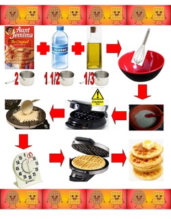
For this assignment, I had to make a flow chart that could show how to make waffles for people who can not read. To do this, only pictures and numbers could be used. Before starting this project, the class actually made waffles. This served as a basis for how the process was done, which we were to use in our flow chart. After this fun activity, it was time to get to work. First, I had to look up a recipe for waffles online so that I had the exact measurements for the ingredients. I decided to choose an easy recipe that consisted of waffle mix, water, and oil to make things simple. I then found pictures of my needed items, such as the ingredients, bowls, mixers, cups, pan, and a timer, and then saved them for future use. I then inserted these pictures in the correct recipe order in a blank document of Publisher. I inserted arrows so that the steps would be easy to follow in the right order. The pictures were shrunk so that all of the steps could fit on one page. I then added a border to tie everything together, using a color scheme of red and yellow, which was used throughout the entire project. At the top of my flow chart project page is a border that consists of different shaped animated pancakes. This was added to add something that was fun and pleasing to the eye. I then started the actual recipe by putting pictures off waffle mix, water, and oil. Beneath these pictures is their proper measurement, using a number and a picture of a cup. The pictures then show to put these ingredients into a bowl and mix them. A picture is then shown, telling the person to pre-heat the waffle iron. The mix is put into the waffle iron, which is then closed. After a few minutes, the waffles are finished and ready to eat. This is what my flow chart looks like, just a bunch of easy pictures that help show how to make waffles. During this project, I didn’t receive much feedback. This is due to the fact that I did most of this project by myself at home. At the end, however, my friends did tell me if the directions were clear or not. If something was hard to understand, I would then change it. Other than that, I was told that my project was neatly designed. Also during this assignment, I further strengthened my knowledge of the tools of Publisher. Even though I didn’t necessarily use anything new for this project, I am now becoming faster at accomplishing what I want. After using this program several times throughout the year, I can easily access the tools I need without too much thought. It is becoming a lot easier to get stuff done. These are the skills that will be able to help me with other school projects. For example, in one of my classes I had to design a book cover, and I decided to make it using Publisher. If I were to do this project again, I don’t think I would do many things differently. This is because overall, I was happy with the way my flow chart came out. However, if I had to change something, I would probably change the recipe I used. If given another chance, I would use a more complex recipe in order to give myself a challenge. This is because a lot of people make waffles from scratch. I may have also changed the border. In my project, the border is only placed at the top and bottom. I would have made it smaller so that all sides of the paper could be surrounded by it. To me, it would make my project flashier.
Calendar: Sheet 7 Side 1
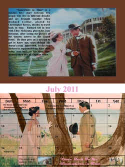
For this graphics project, I have been assigned to create a 2011 calendar. In order to start this assignment, I first had to think of a theme. I chose to do mine on all of my favorite movie quotes. Before starting, I had to look up the exact quotes from the movies, as well as find a few usable pictures from each movie. To make my life easier, I assigned each movie to a specific month. I then looked up some important dates for each month that would need to be included in my calendar. I also found a template I could use, so that I would just have to copy each month into the document, instead of making one myself. After this was completed, I was ready to officially begin working on the calendar. This project was to be done using Publisher. I first separated my page into two equal parts. I did this because the top half would be for the movie picture and the bottom half would be for the actual calendar. The first month I started with was July because both the picture and calendar would be on the same page. So, I inserted the July month template and re-sized it to fit the bottom half of the page. I then typed in the important dates that occur in that month. The template was set to be transparent so that I could put a picture in the background. For this project all pictures had to be edited in some way. To do this, I used Photoshop. The blank boxes in the calendar needed to be filled. This is where I put my favorite quote in that movie. I also had to put a small image of the original pictures, not edited, into these boxes to prove that I worked on them. Also, if needed, I put interesting facts about the movie. On the top half of the page is where I had to write five sentences to summarize the events of the movie. This paragraph was placed on another edited picture relating to the movie. This is all that was put on the top half of the picture. This same process was used to design the back side of the seventh page. The only difference, however, is that the top half of the page was for the month of August, and the bottom half was for June. After this was completed, all work was saved, and the page was printed duplex style.
Calendar: Sheet 7 Side 2
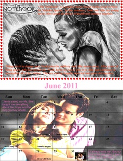
The movie for the month of July was “Somewhere in Time.” At the top of my page is an edited picture of Richard and Elise in front of the Grand Hotel. To edit this picture, I changed the colors a little bit and enhanced the picture frame border. At the top of the picture is my paragraph summarizing the movie. It basically describes the characters, the love story, and the tragic ending. At the bottom half of the page is the July template. Important dates, such as Independence Day and Parent’s Day are included. Behind that, I edited a picture of when Richard and Elise first meet. To this picture, I changed all the background colors of the ocean, and used the tools of Publisher to make the tree look livelier. In the empty spaces are the two original pictures, the quote “Come Back to Me”, and interesting facts about the movie’s theme song and filming location.The month of August is on the first half of the second sheet. For this month I chose the movie “The Notebook.” The main picture I used was a sketch of Noah and Allie. Using Photoshop, I was able to darken all of the lines so that the picture had a charcoal look. The paragraph about the movie, which talked about the author and the brief storyline, was split to fill the space around the image. A border of hearts was placed around the picture to create that love story feel. At the bottom half of the page is the month of June. For this month, I chose one of my all time favorite movies “A Walk to Remember.” I used the June template and included the dates of Flag Day, Father’s Day, summer, and a few others. The picture I used was when Landon and Jamie were cuddling under the stars. In Photoshop I changed the entire background, making it look smokey and cloudy, as well as changed the color of their outfits. The original photo is placed in one of the empty spaces. Also in those spaces is my favorite quote. This quote was said at the very end of the movie, after Jamie died. For this assignment I received a lot of feedback from my peers. I was told by many how they liked my idea of movie quotes. I was also given advice on what tools in Publisher I should use to edit my pictures. I sometimes tried the suggestions that were given to me. I also asked my friends whether or not everything flowed together. If they said no I would change little things in order to fix it. Sometimes, I was stuck on choosing a quote for a certain movie. My peers helped me decide which one would fit best into the calendar. Overall, my friends were the ones who made my project better. During this assignment, I learned how to use many new tools in Publisher, such as the color replacement tool. This really helped me to change the original pictures in order to make the color schemes I wanted. It also helped to create unity among the different pictures throughout. These tools can be used outside of school. Sometimes it could be fun to edit pictures of you and your friends. These tools can help make the pictures funny or more realistic, or out of this world. Who knows! If I were to do this project again, I would definitely change the brightness of the pictures on the bottom half of both sides. This is because some dark colors were used and it was a little hard to read the writing. If these pictures were brightened just a little bit, then the words would be easier to read. I also might have tried to get rid of the pixel spots. This would make my assignment look nicer and cleaner.
Poster Project
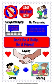
In my graphics class, all level one students had to create a poster for the Knights of Pythias poster contest. This year’s theme was “Don’t be a Bully, be a Friend.” Before starting this assignment, we were given a flyer. On this flyer was some of the requirements that the poster creator would need to know, such as the page size. The size of the poster had to be 14 by 22 inches. The flyer also stated that all art throughout the poster had to be original. No copyright material was allowed to be used. Other than that, the poster creator could do whatever he or she please, creative wise. I made my poster using Publisher. I first set the page size to the required measurements. I put the title of the poster in large letters using word art. My next step was to browse online to find ideas of what a friend is and what a bully is. Using paint I then colored in pictures of bullies and of friends, and even created my own computer, stop sign, and a few other objects. These would then be used as the graphics to get my point across. My work was then saved and printed out. Throughout my entire project piece, I used a color scheme or red and blue. The border of my poster is a blue outline of a person. This was to show unity and friendship among all people. My poster is split in to two halves. In the center is my title in blue lettering with a red background. The top half of my poster is describing what a bully is. I have a picture of a fist, to represent violence, a picture of a computer, to represent cyber-bullying, and a picture of a note, to represent threatening. Also on the top half is a picture of a kid being bullied and a stop sign to get the point across that bullying needs to stop. On the bottom half of my poster describes what a friend is. I have a picture of two people holding hands with hearts all around it. This is to signify peace amongst all people. I then put a picture of a women helping a sick kid to represent friends being caring towards each other, as well as a picture of a friend giving another friend a teddy bear to represent sharing. At the bottom of my poster is the required label that states “Sponsored by the Fraternal Order Knights of Pythias.” Considering that I completed this project while at my friend’s house, I received quite a lot of feedback from her. Throughout the entire project I was told whether or not, my theme was easy to understand. At some points, I even had to ask whether or not my created objects were good or not. My friend always gave me advice on how to further improve my poster. If she suggested using a certain picture, then I would re-create it and use it. If something was positioned in an odd way, she would help me re-design it to make it more pleasing to the eye. Overall, all of my feedback received was good, and the things that weren’t, I used to improve my project. During this assignment, I further strengthened my ability to use tools in Paint and Publisher. I was able to create my own pictures and use color tools. I also refreshed my memory on some important quality traits of a friend that will help me all throughout my life. It is important no to hurt others by being a bully. Many people don’t realize how much that affects people’s lives. This will help my in school. I can use my skills in Paint and Publisher in any school assignments as well. If I were to do this project again, I wouldn’t change much. I would probably add more examples to what a friend is, considering I only used three. I also might have put a color into the border make it pop a little more. Lastly, I would probably put a picture into the background of the poster so that there would be less white space to distract people.
